Aside from revision control and coding standards, college students aren’t exposed to another important part of software development, namely, the significance behind the choice of programming font.
Okay, so the choice of font isn’t really that important. But it’s still worth considering when you take into account that you’re going to get noticeable benefits for such a small investment.
The most logical reason why you’d want to choose a good programming font is to make coding easier. Good programming fonts are monospaced, making it much more easier to find out whether you’re following coding standards or not (e.g. indention, character limit per line). Good programming fonts should allow you to differentiate between “I” and “1” and “l”, and “0” and “O”, a common source of errors that can sometimes slip under the compiler’s radar.
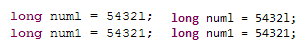
In the picture above, on the left is Courier New, the default font for most text editors and IDEs on Windows. We could see here how close its “l” is to “1”; an inexperienced programmer would think that the first variable’s value is 54,321 while in reality it’s just 5,432 with the trailing “l” defining it as a long integer in Java.
On the other hand, the example on the right is in Consolas. It’s much easier to see the difference between “l” and “1” in this font.
Another benefit to choosing a good font for programming is that they can affect your mood. You may think it’s illogical for appearance to affect one’s coding productivity, but just ask any developer who loves their MacBook Pro and you’ll get a passionate speech on how their toy development tool has increased their productivity substantially.
People like me choose clean, anti-alias friendly fonts like Consolas because clean looking code makes me feel compelled to write cleaner code so as not to ruin its “beauty”. Other people choose bitmapped fonts like Proggy to make them feel like they’re really hacking away at code.
—
There are a lot of discussions on the net about which programming font. Most of them typically end up linking to this Coding Horror post or this StackOverflow poll. Anyway, here are the programming fonts I’ve used over the years:
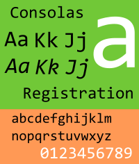
My main PC runs on Windows 7 so Consolas is a no-brainer. Not only does it come with the OS (so no extra download is needed), it’s also clean and works well with Windows’ ClearType technology.
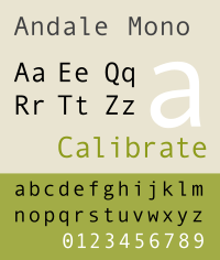
Back when I was still into J2EE development, my development machine ran Windows 2000. It didn’t have ClearType so Consolas was out of the picture. Instead, I used Andalé Mono which still looked good on LCDs even without ClearType.
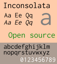
When I have to develop in Ubuntu, I just fire up Synaptic and look for Inconsolata, a font is inspired by Consolas.
—
tl;dr: Courier New = Bad. Experiment with fonts that look good on your machine.
(font samples taken from Wikipedia)
nice article, I’m using Anonymous Pro as my font.