
I don’t like design work.
Whether I like it or not, I still have to do it since it’s part being a web developer. Fortunately, I get to learn a couple of tricks once in a while to make life a bit more interesting.
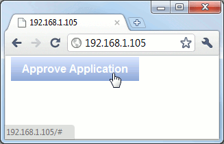
One of those is how to turn a boring link into a “Web 2.0” button:
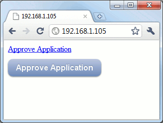
Half a decade ago, you’d have to use an image for this effect. Thanks to the CSS3 support in modern browsers, you can implement this using only CSS. Here’s how you do it.
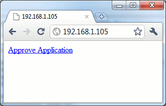
First off, let’s write our initial HTML code:
<html>
  <body>
    <a href="#" class="button">Approve Application</a>
  </body>
</html>
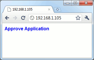
Then let’s add some basic style:
  <style type="text/css">
    a.button {
      font: bold 1em/1.5em sans-serif;
      text-decoration: none;
    }
  </style>
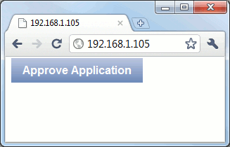
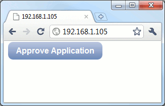
Now to add the padding and gradient to make the link look like a 3D button. For the gradient part, I used the Ultimate CSS Gradient Generator‘s Grey Blue 3D #1 preset.
I also had to add zoom: 1; to make the effect work on IE.
    a.button {
      font: bold 1em/1.5em sans-serif;
      text-decoration: none;
      color: white;
      padding: 0.5em 1em;
      background: #b8c6df; /* old browsers */
      background: -moz-linear-gradient(top, #b8c6df 0%, #6d88b7 100%); /* firefox */
      background: -webkit-gradient(linear, left top, left bottom, color-stop(0%,#b8c6df), color-stop(100%,#6d88b7)); /* webkit */
      filter: progid:DXImageTransform.Microsoft.gradient( startColorstr='#b8c6df', endColorstr='#6d88b7',GradientType=0 ); /* ie */
      zoom: 1;
    }
Now to add the hover behavior. I just copied the background to the :hover pseudo-class and added #202020 to the colors to make it lighter.
    a.button {
      font: bold 1em/1.5em sans-serif;
      text-decoration: none;
      color: white;
      padding: 0.5em 1em;
      background: #b8c6df; /* old browsers */
      background: -moz-linear-gradient(top, #b8c6df 0%, #6d88b7 100%); /* firefox */
      background: -webkit-gradient(linear, left top, left bottom, color-stop(0%,#b8c6df), color-stop(100%,#6d88b7)); /* webkit */
      filter: progid:DXImageTransform.Microsoft.gradient( startColorstr='#b8c6df', endColorstr='#6d88b7',GradientType=0 ); /* ie */
      zoom: 1;
    }
    a.button:hover {
      background: #d8e6ff; /* old browsers */
      background: -moz-linear-gradient(top, #d8e6ff 0%, #8da8d7 100%); /* firefox */
      background: -webkit-gradient(linear, left top, left bottom, color-stop(0%,#d8e6ff), color-stop(100%,#8da8d7)); /* webkit */
      filter: progid:DXImageTransform.Microsoft.gradient( startColorstr='#d8e6ff', endColorstr='#8da8d7',GradientType=0 ); /* ie */
    }
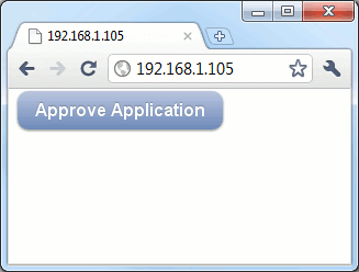
Now to add the “Web 2.0” rounded corners via border-radius:
    a.button {
      font: bold 1em/1.5em sans-serif;
      text-decoration: none;
      color: white;
      padding: 0.5em 1em;
      background: #b8c6df; /* old browsers */
      background: -moz-linear-gradient(top, #b8c6df 0%, #6d88b7 100%); /* firefox */
      background: -webkit-gradient(linear, left top, left bottom, color-stop(0%,#b8c6df), color-stop(100%,#6d88b7)); /* webkit */
      filter: progid:DXImageTransform.Microsoft.gradient( startColorstr='#b8c6df', endColorstr='#6d88b7',GradientType=0 ); /* ie */
      zoom: 1;
      border-radius: 10px;
      -moz-border-radius: 10px;
      -webkit-border-radius: 10px;
    }
    a.button:hover {
      background: #d8e6ff; /* old browsers */
      background: -moz-linear-gradient(top, #d8e6ff 0%, #8da8d7 100%); /* firefox */
      background: -webkit-gradient(linear, left top, left bottom, color-stop(0%,#d8e6ff), color-stop(100%,#8da8d7)); /* webkit */
      filter: progid:DXImageTransform.Microsoft.gradient( startColorstr='#d8e6ff', endColorstr='#8da8d7',GradientType=0 ); /* ie */
    }
And finally, let’s add shadows to the buttons via RGBa. This uses alpha transparency instead of us having to assign colors manually to the shadow.
    a.button {
      font: bold 1em/1.5em sans-serif;
      text-decoration: none;
      color: white;
      padding: 0.5em 1em;
      background: #b8c6df; /* old browsers */
      background: -moz-linear-gradient(top, #b8c6df 0%, #6d88b7 100%); /* firefox */
      background: -webkit-gradient(linear, left top, left bottom, color-stop(0%,#b8c6df), color-stop(100%,#6d88b7)); /* webkit */
      filter: progid:DXImageTransform.Microsoft.gradient( startColorstr='#b8c6df', endColorstr='#6d88b7',GradientType=0 ); /* ie */
      zoom: 1;
      border-radius: 10px;
      -moz-border-radius: 10px;
      -webkit-border-radius: 10px;
      -box-shadow: 0 1px 3px  rgba(0,0,0,0.5);
      -moz-box-shadow: 0 1px 3px rgba(0,0,0,0.5);
      -webkit-box-shadow: 0 1px 3px rgba(0,0,0,0.5);
      text-shadow: 0 -1px 1px rgba(0,0,0,0.25);
    }
    a.button:hover {
      background: #d8e6ff; /* old browsers */
      background: -moz-linear-gradient(top, #d8e6ff 0%, #8da8d7 100%); /* firefox */
      background: -webkit-gradient(linear, left top, left bottom, color-stop(0%,#d8e6ff), color-stop(100%,#8da8d7)); /* webkit */
      filter: progid:DXImageTransform.Microsoft.gradient( startColorstr='#d8e6ff', endColorstr='#8da8d7',GradientType=0 ); /* ie */
    }
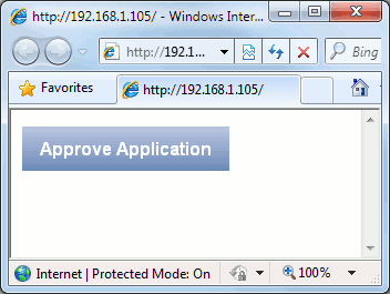
And there’s your Web 2.0 button. Note that the borders won’t be rounded in IE versions that don’t support border-radius e.g. IE 8.

Nice! This still works :) Thank you.
Finally an easy solution to my problem, thanx a lot
good work.Iam waiting for this kind of change.. really simple and superb